


Photo by Daniel Tong on Unsplash
A Hired Imposter’s Secrets #6⇒ (My Design Process)
My process of planning and designing an app before I open VSCode


So you’re working on something new
Ok, so you have a project assigned to you at work, or you just had the genius idea of solution for a problem that you can fix for a friend, company, or maybe you want to automate your workflow. Now, you’re ready to start the project and make it happen, but wait, where do I start?
Many things come into play when building out the front end of a project, and while you’re doing it, you want to ensure that the process is as smooth as possible. This is my approach and how I tackle this at work and in my projects. Again, this is my process; other people may have a different process.
I’d love to hear feedback around this and things that I can add/remove to streamline my approach in the comments below.
Get an idea of what the project entails
Understanding the problem you’re solving is essential. This is important because you’re going to have to walk your user through the variables of that problem with what you’re building. You have to figure out how to make that process flow smoothly to provide a fantastic user experience.
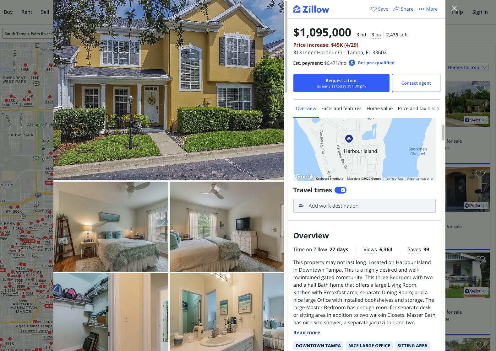
So let’s take a popular program to break down the process of what I’ve stated below with a popular solution almost everyone here has used. For the sake of time, this will be a high-level MVP (minimum viable product) overview. So the problem is, I need to find a home. The solution we're using to this problem is Zillow.com.
What to consider when wire-framing and creating your mockups
Ok, so we’re ready to start figuring out the user story and how we’re going to make these variables flow on the screen. What will your home screen look like, and how will you direct the user through the problem to come up with the solution? Let's take a look at how Zillow accomplishes this.
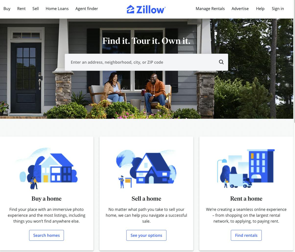
Homepage
From the homepage, you can see that they do a great job by having a search to get them to dive into the app.
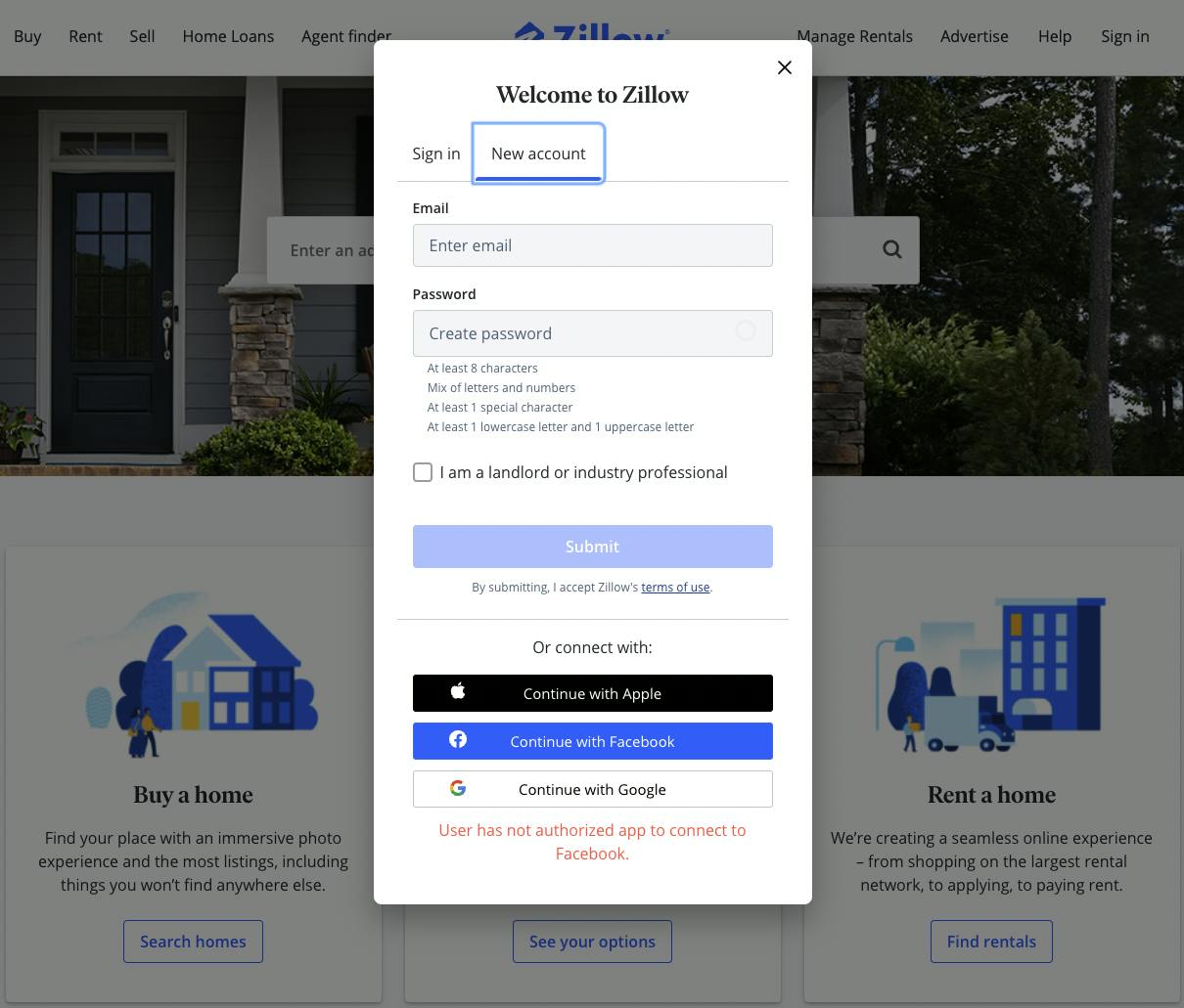
Sign In
Are you going to have users? What’s sign-in going to look like?
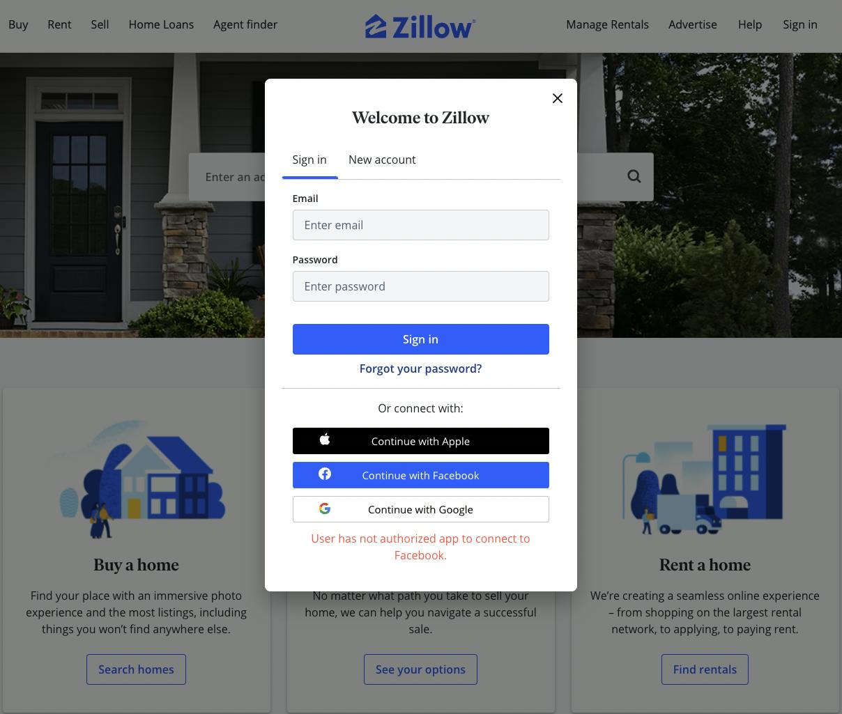
Wait a minute, do they not have an account yet? What’s a new account going to look like?
Core App
Now let’s look at how they decided to lay things out to help the user with the problem. They’ve tackled the location issue based on their search on the homepage. Then that search takes them to the core app functionality.
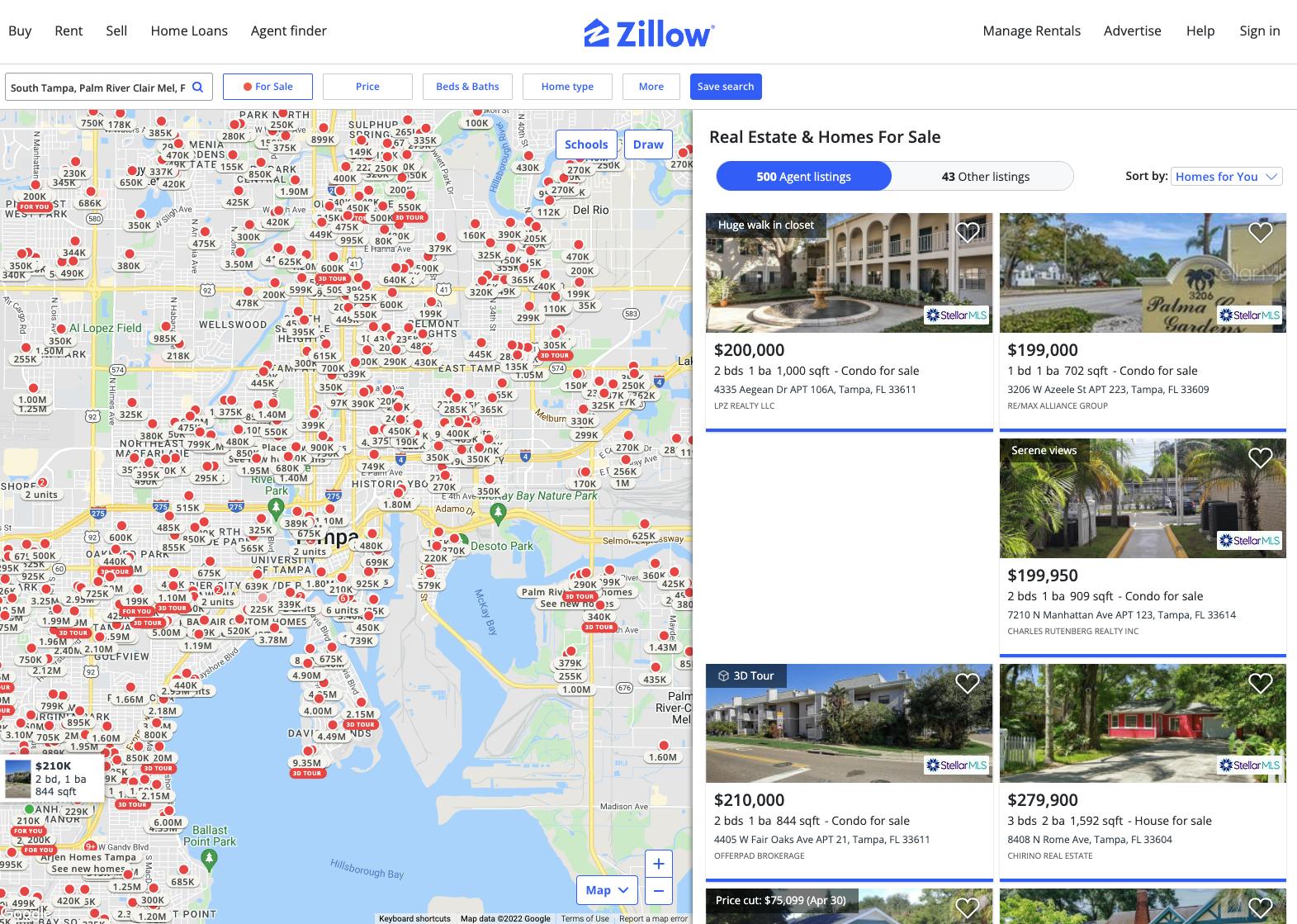
It has a fantastic map that shows a badge w/the price point attached to it.
in the top left, you can run a search again
- Filters they have setup
- Sale, rent, or sold
- Min-Max Price
- Home types
- For more customizable options, they have a section.
These were more than likely highly requested features Zillow added on as they grew. Requesting and listening to what the user needs and wants are crucial to the success of a solution.
Property details section
Here we have a grid of photos on the left showing how the home looks and a granular details section that you can scroll through on the right.
Now open up Figma and start the wireframe/mockup
Figma is a great tool that you can use to design a wireframe or mockup. I've found it beneficial, to begin with, Figma first rather than diving into the code. Figma helps you make sure your solution's design, look and feel are unique.
On Zillow's core app and property details page, there is a lot of info to be displayed. Figma enables you to play around with the layout to see how you want to show what is essential in your app. It is way quicker than coding these things out to find out you didn't like how it looks and then switch it out. Please don't put yourself through that.
Do you have a problem with how to make it look and feel?
Go to the competition. Most of the time, there is already some variation out there with the things we will create. Look at how they did it and how you can make it different and better. Add your flair and showcase your niche way of solving the problem and what makes you different.
For example, Facebook already had a feed and was an incredible social platform when it started. We all know Facebook's features with posts, photos, check-ins, videos, friends, etc. However, a cool company called Instagram wanted to focus and be great at one thing, photos. Facebook already had a way to share pictures and did it very well. However, Instagram had a niche approach to how they wanted to share images by improving them quickly and sharing. Add your niche approach.
Tools to apply your niche approach that I use!
- Dribble.com. I go there to get design ideas from multiple designs so I can mix things to make them my own.
- Undraw.co to get awesome customizable SVGs that match my color scheme.
- Fontawesome, Flaticon.com, React-Icons, and others to keep my icon game on point.
- Tons of CSS generators that you can google for bubbles, and graphics to add to the page
Figma can be used in a big way to manipulate and customize the above.
Once your mockup is done, get approval from management/client and edit according if needed, open up VScode, and get to work!
-RAllanVila
As always, I want to hear your feedback in the comments below. If you found this helpful, it would mean the world if you shared it with others you think it could help. You can also follow and DM me on Twitter @RAllanVila for more helpful tips and schedule a time to chat